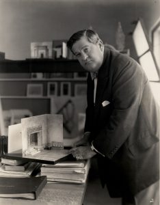
Looking across Joseph Urban’s many projects, which span a mind-boggling variety of applications and styles, three qualities stand out as hallmarks of the artist’s style: a daring and perceptive use of color, theatricality and approaches drawn from Viennese modernism. Combining these elements, Urban created a visual and spatial language and energy that captured the essence of metropolitan American life in the 1920s.
Spellbinding Color
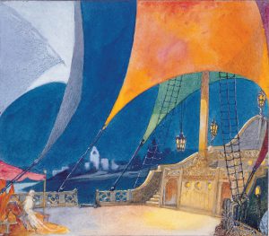
My arrival in the [Egyptian] harbor of Alexandria [at age 19] was really my first big color impression. The strange deep blue of the Mediterranean; the white city, the flaming sails of boats, the riot of color in costumes and over all a purple sky. This enormous impression followed me my whole life and dominated for years my color schemes.
Joseph Urban, quoted in Otto Teegan’s “Joseph Urban’s Philosophy of Color,” 1934.
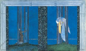
A daring and unprecedented use of color to conjure mood and energy persisted throughout Urban’s career. In fact, some critics suggest that his use of color is the most defining aspect of his work. A pure, penetrating shade of cerulean blue often employed by the artist became known as “Urban Blue,” a description still used in artistic and theatrical circles today.
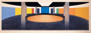
Urban’s talent as a colorist is evident in the unexpected combination of colors in the Wormser Bedroom and in his dynamic watercolor sketches for opera and theatrical productions. At the New School for Social Research in New York, the artist used broad applications of solid color to heighten the illusion of space and create a sense of unity and progression within the International-style building.
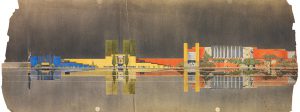
Perhaps the greatest testament to his understanding and skilled use of color was his appointment as director of color for the 1933 Century of Progress International Exposition in Chicago. There, he composed and directed a visual symphony of color and light that played across the world fair’s buildings, exhibits and landscaping.
Designing for the Drama of Modern Life
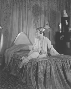
Urban was an expert storyteller, a skill honed through his early work in illustration and stage design. No matter the project, he realized that for authenticity and success, he must fully know his characters (or inhabitants), his audience (or clients), and the narrative to be told. When a project lacked an inherent storyline, he developed one as part of his working process. As historian Christopher Long observed, “Even when he wasn’t designing stage sets, his interiors came off as places for drama—the drama of modern life.”
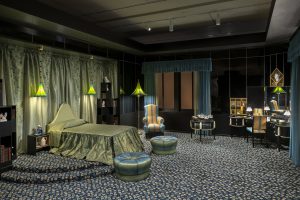
A description of the completed Wormser Bedroom, likely produced by Urban’s studio, read, “[Urban] has introduced a touch of Viennese merriment that bespeaks the happiness of youth. The artist’s conception was that a girl is asleep on a hill looking down upon a flowered meadow. Accordingly, the bed stands on a platform. The carpet represents clusters of meadow flowers.” The reflective black glass walls of the Wormser Bedroom, as one critic noted, placed its inhabitant in the “bold relief of a cameo.” The “constant reflective play” and “movement of continually changing images of people” breathed life into the space.
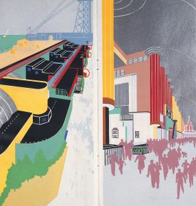
Similarly, when Urban was working on designs for the Century of Progress International Exposition, a world’s fair held in Chicago in 1933, his assistant, Shepard Vogelgesang, remarked, “Urban visualized the Exposition buildings as a background for moving crowds. . .. He selected his palette for the effect that would be produced by people moving before the masses of color. He tried to get life into his most colossal of settings—blood, warmth, texture and motion.”
A Dash of Vienna
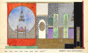
Though he worked tirelessly to create a distinctly American brand of modernism, Urban never abandoned the influences of Viennese modernism. In fact, it was likely his integration of the Viennese Moderne—a style that balanced utility and simplicity with a rich, colorful and playful flair—that made modernism more palatable for his American audiences.
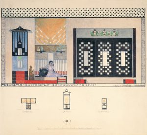
Urban demonstrated how pure geometry, strong color, and florid embellishments could work together to create spaces that reflected the freshness and spontaneity of contemporary urban life. In his opera set designs for Madame Butterfly and Il Segreto di Susanna he combined the geometric gridding, bold colors and geometricized floral decoration frequently associated with the work of the Wiener Werkstätte.
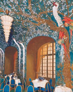
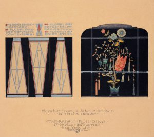
In designs for the St. Regis Hotel and the Bedell Building, Urban channeled the dense and dramatic botanical patterns championed by Austrian artists like Gustav Klimt and Dagobert Peche, pairing them with modern geometric lines.
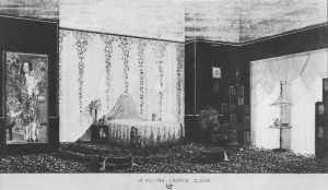
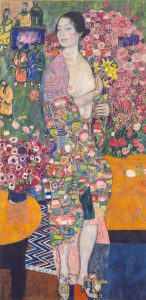
A 1930s description of Elaine Wormser’s bedroom noted, “[Urban] has introduced a touch of Viennese merriment that bespeaks the happiness of youth.” Urban included elements from modern Viennese artists, possibly leftover from his Wiener Werkstätte of America showroom. These included a ceramic head by Vally Wieselthier and vibrant enameled dresser dishes and boxes. His trumpet-shaped, striped silk lamp shades recalled those designed by Dagobert Peche. And, although the painted copy of Gustav Klimt’s The Dancer that Urban originally envisioned in the room was never incorporated, its color palette and patterning influenced the designer’s choice of hues and floral motifs. Together, these elements added a light sensibility to the space—a perfect foil to the room’s sultry black glass walls.
